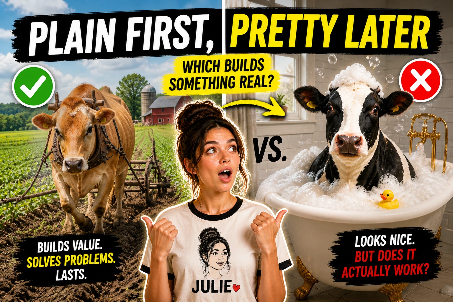
Plain First, Pretty Later
Beginners often polish too early.
The template isn’t working yet, but the fonts are beautiful. The structure isn’t clear, but the colors are coordinated. Hours disappear into aesthetic decisions while the core job remains untested.
This feels productive. It isn’t.
Polish is the last layer. It goes on top of something that already works. Without that foundation, polish is decoration on an empty frame.
Why Early Polish Happens
It’s easier to choose colors than to make decisions about structure.
Structure requires thinking. What belongs here? What order makes sense? What should be left out?
Aesthetics require taste. Which you already have. You can see whether something looks good. The feedback is immediate.
So when building feels hard, polishing feels like progress. You’re doing something. The screen is changing. The template is getting prettier.
But prettier doesn’t mean more useful.
I spent an entire evening once adjusting the spacing between sections in a Canva template. Pixel by pixel. The alignment was satisfying. The balance was right.
Then I sent it to a friend and asked if it made sense.
She didn’t understand what to do with it. The instructions were vague. The sections weren’t labeled clearly. She couldn’t figure out where to start.
The spacing was perfect. The template was useless.
What Actually Matters
A plain checklist that helps someone finish a task is more valuable than a beautiful checklist they abandon.
A simple calculator that gives the right answer is more valuable than a branded spreadsheet with confusing inputs.
An instructions page that explains how to use the template matters more than custom fonts.
Usefulness first. Aesthetics follow.
When someone downloads your template, they don’t admire it. They try to use it.
They open the file. They look around. They try to understand what to do.
If those first moments are confusing, they close the tab. They don’t notice the design. They notice the friction.
Examples Over Style
The strongest templates include examples.
Not descriptions of what to write. Actual examples of what someone might write.
A budget template with sample numbers already filled in. A content planner with example posts showing the format. A checklist with one item already completed so users can see how it works.
Examples do more than style ever could. They show instead of tell.
I used to write instructions like “Enter your weekly expenses here.” Clear enough, I thought.
But when I added an example row showing “$45 – Groceries – Tuesday” the whole template became easier to understand. The format was obvious. The expectation was set.
Actually, I should have done this from the start. I don’t know why I resisted. Maybe examples felt like hand-holding. But hand-holding is often what people need.
Starting Simple
Open notion.so or canva.com or whatever your platform is.
Start a blank page.
Don’t browse templates for inspiration. Don’t look at what others have made. Just start.
Make the basic structure. Headings. Sections. The skeleton of your idea.
Save it. Even if it’s ugly.
This is your first version. It exists. That’s more than most ideas achieve.
Now you can test it. Use it yourself. Notice what’s missing. Notice what’s confusing.
Then improve it. Not polish it. Improve it.
Add the instructions someone would need. Add the examples that show how it works. Adjust the order if it feels wrong.
Still plain. Still unpolished. But more useful than before.
How a Buyer Opens It
Think about the moment someone opens your template for the first time.
They’ve downloaded it. They’ve clicked the file. They’re looking at the screen.
They don’t know you. They haven’t read your description carefully. They just want to use the thing they paid for.
What do they see?
If they see a wall of beautiful sections with no clear starting point, they’re lost.
If they see a simple structure with clear labels and one example filled in, they know what to do.
The screen in that moment matters more than any color choice.
I remember opening a template I’d purchased once. The aesthetics were stunning. Rich colors. Custom icons. Gorgeous layout.
But I couldn’t figure out how to start using it. The beauty was a barrier. Too much to take in. No clear path forward.
I closed it and never opened it again.
Plain and clear beats beautiful and confusing. Every time.
Finishing Ugly
Give yourself permission to finish something ugly.
The first version doesn’t represent your taste. It represents your thinking.
Taste comes later. Once the thinking is right.
Ship the plain version first. To yourself. To a friend. To one early buyer if you’re feeling brave.
Get feedback on whether it works. Not whether it looks good.
Then, only then, make it pretty.
The cursor blinks on an unfinished page. The page looks rough. That’s okay.
Rough and done beats polished and stuck in drafts.
